The Woeful State of BlackBerry UI Controls
I continue to be impressed with the build quality and overall polish of the BlackBerry Bold as an end-user device… at least for basic functionality. While some may not like the way BlackBerry push email works, I find it to be pretty nice.
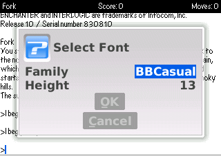
As a developer, I’m much more disappointed developing using the BlackBerry native API than I expected I would be when I started playing with my little ZBerry project. Marcus Watkins offers excellent insight into the world of BlackBerry development , which I won’t try to rehash here. The part that I find incredibly frustrating is the lack of decent reusable user interface controls. As Marcus details in his blog post, the provided UI functionality has the bland look and feel of the base operating system. Even more frustrating to me is how little flexibility there is even within the standard controls. For instance, I wanted to provide the user the ability to customize the font used in the text display. Using the standard functionality yields the following dialog.
Wow, look at the size of that dialog relative to the screen. All of that wasted space. So much space could be saved if:
- The extra space between the label and field contents wasn’t there.
- The OK/Cancel buttons were laid out horizontally instead of vertically.
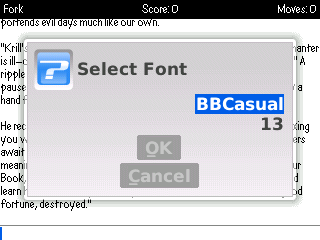
What’s worse is that the, while the change listener support attached to those fields is capable of updating the story font on the fly, the user can hardly see the text. Thinking there had to be a way to control things a little bit better, I tried to turn off the label text. If I could lay out the two fields side-by-side, it might be better. Unfortunately, there appears to be no way to do that. Setting it to blanks yields a dialog that is even a bigger waste of space.
Given that there is vertical and horizontal layout field management, why must the label and text field be tied together like this? I’m sure some of it boils down to legacy hardware support for things like the trackwheel. But it would be nice to be able to selectively break free of those restrictions.
While the API would certainly allow me to build a version of these controls from scratch, that seems a silly thing to have to do. Doing so implies the need to account for the various input options (trackwheel, trackball, keyboard, etc), do all of the rendering and focus management that these controls are already handling. Admittedly, this is still an issue of “look and feel”, but it is disappointing to see something so simple be neglected.
With that said, the text input and output controls are pretty impressive, saving effort on that side of the implementation. I guess it should come as no surprise that the strongest parts of the BlackBerry API revolve around features such as email that have been in the platform for a very long time.

